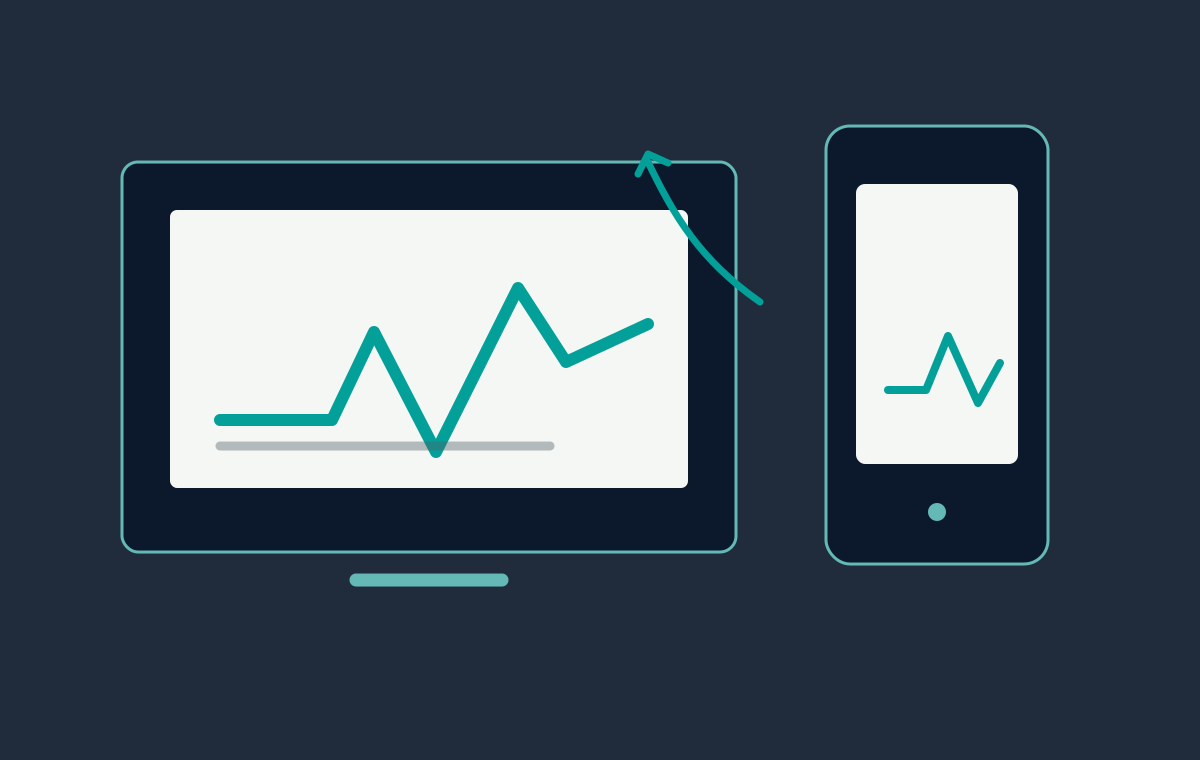
Responsive quality is more than making a desktop page narrower. It is the discipline of preserving hierarchy, speed and confidence as the context changes.

Review the layout as a system
Start with the content order, then inspect the grid at wide desktop, laptop, tablet and small mobile widths. Look for clipped text, awkward line lengths, sticky elements that cover content and controls that become difficult to tap. A good breakpoint changes the composition when the content needs it.
Three quick device checks
- Complete the primary journey using touch only.
- Rotate the device and repeat the most important interaction.
- Use keyboard focus to confirm that no control disappears off screen.
Reduce the cost of the first view
Use correctly sized images, modern formats where practical and explicit width and height attributes. Defer non-critical scripts and keep animation work on the compositor. The page should feel responsive before every asset has finished loading.
Protect clarity and accessibility
Maintain readable contrast, visible focus states and semantic headings. Motion should support the content and respect a reduced-motion preference. Forms need labels, useful validation and a clear success message on small screens.
Measure, then refine
Pair a real-device pass with browser performance tools and a short list of user journeys. Fix the largest source of friction first, then repeat the same checks after deployment. This creates a dependable loop for WordPress builds and custom front ends alike.
For a responsive build or performance review, send me the current site. You can also browse the portfolio work.